Group-Centric UI/UX Case StudyGROUPGO
Enhancing Experience Discovery and Booking Through Collaborative App Design
My Role: UX Researcher and Designer
Whether you seek adventure, relaxation, or quality time with loved ones, GroupGo is the ultimate resource for making the most of every moment. Together, we can explore the world around us and create lasting memories that enrich our lives.
PROBLEM
The process of searching for and reserving experiences has long been plagued by inefficiencies and complexities. Users face the daunting task of sifting through countless options, dealing with divergent preferences within groups, and grappling with communication hurdles. The challenge at hand revolves around enhancing the experience of discovering and booking activities for both individual users and groups.
OBJECTIVE
To present a solution that alleviates the time-intensive and stressful nature of experience searching and to facilitate effective decision-making within groups.
SOLUTION
GroupGo is a dynamic group booking app meticulously crafted to revolutionize experience discovery. The app boasts advanced filters, refining options based on individual preferences. This streamlines the search process, catering to the need for personalized experiences.
Its key feature is the group functionality, where users can form groups, collectively vote on activities, and book them together. This feature addresses the perennial problem of harmonizing group preferences and communication, fostering seamless coordination.


OVERVIEW
In a world where time is precious and options are endless, the challenge of efficiently discovering and booking experiences has become more pertinent than ever. This case study delves into the journey of addressing this challenge and presents GroupGo – a pioneering solution designed to transform the way users explore and engage in local activities.
MY ROLE
As the visionary behind GroupGo, my role spanned the entire design journey. From comprehensive research and user interviews to meticulous design and rigorous testing, I undertook every facet of the app's creation. The primary objective was clear: alleviate the time-consuming and stressful aspects of activity hunting and booking.
WHAT I DISCOVERED
During the research phase, a striking revelation surfaced – a significant portion of users seek to engage in activities as part of a group, whether with friends or family. However, the challenge lies in the often difficult process of achieving consensus and effective communication within groups. Armed with these insights, I embarked on designing an intuitive app interface that caters to individual preferences, while also addressing the challenges faced by group bookings.
THE REMEDY
GroupGo offers a two-fold remedy: a comprehensive repository of local activities and an innovative group-oriented feature. By giving users the ability to create groups, wherein members can collaboratively vote on and book activities, GroupGo fosters seamless coordination. This innovation not only streamlines the decision-making process but also cultivates a sense of shared engagement and experience. Moreover, GroupGo is attuned to individual preferences, employing smart filters to facilitate tailored discovery. This resonates particularly with those seeking activities aligned with their unique tastes.
In essence, GroupGo stands as a testament to the power of user-centric design and thoughtful problem-solving. Through meticulous research and unwavering commitment, I forged a solution that not only eases the burden of activity booking but also fosters seamless collaboration among groups.
DESIGN PROCESS
RESEARCH
I initially sent out screener surveys to find potential interview candidates and conducted those interviews via a series of phone calls. I compiled all of the data I accumulated from the interviews and this led to the creation of my empathy maps and user personas, which in turn helped to identify the problem and reveal key insights.SCREENER OBSERVATIONS
Who users book for
How often users search
46%
Say finding nearby 'things to do' is either difficult or time-consuming and overwhelming
50%
Think the process can be better or easier
90%
Use their phones to search and book activities
USER INTERVIEWS
I conducted user interviews with carefully selected participants from my screener survey. To keep the interviews consistent, I created a detailed script with thoughtful and probing questions. This script guided me in getting honest and comprehensive insights from each participant, with the goal of uncovering patterns, pain points, preferences, and desires that would help shape GroupGo.AFFINITY MAPPING
After I concluded my interviews, I had a wealth of information and needed to synthesize and make sense of it. I began by employing affinity mapping techniques, carefully grouping and categorizing similar ideas and themes. This process allowed me to identify patterns, common pain points, and desires, creating a comprehensive visual representation of user needs.EMPATHY MAPPING
Next, armed with my newfound understanding, empathy maps became my tool of choice. By delving deeper into the emotional and psychological aspects driving user behavior, empathy maps helped me develop a profound empathy towards their experiences. These visual representations brought the human element to the forefront, allowing for a more holistic approach to empathizing with users.PERSONAS
Finally, personas emerged as vibrant representations of distinct user archetypes. Each persona encapsulated the key motivations, goals, preferences, and pain points of a specific group of users, enabling a deeper understanding and empathy from a design standpoint.KEY INSIGHTS
Upon thorough consolidation and analysis of the research data, I classified the most critical insights into four distinct categories. These insights serve as the Foundation upon which the solution and design are built, ensuring a user-centric and effective experience.1. Time
During user interviews and persona development, a recurring theme emerged around the importance of time in the experience discovery process. Users revealed that the sheer volume of available options often led to prolonged decision-making. They expressed a desire to view all available choices, and the back-and-forth exploration of web pages led to significant time consumption, indicating an unmet need for a streamlined and comprehensive option presentation.
2. Preferences
Insights unveiled the significance of location and cost in user decision-making. The inclusion of a map feature that offers a visual representation of activity locations resonated positively with users.
Additionally, a noteworthy observation was users' price-consciousness and how it often prevents them from completing a booking. The concept of a cancellation policy emerged as a potential remedy to alleviate this concern.
Users consistently employ filters to refine their searches. However, a gap in the availability of comprehensive and specific filters within a single platform highlighted a potential area for improvement.
3. People & Communication
User behavior revealed a prominent inclination towards group-oriented booking. Rather than seeking activities solely for themselves, a majority of users expressed a preference for group-based experiences.
However, this collective decision-making approach has its challenges. Individuals within groups have different preferences and availability, making effective communication and customization difficult. This insight sheds light on the complexities of group decision-making and the need for a solution to bridge this gap.
4. Organization
As users navigated various websites in search of suitable activities, a prevalent habit emerged – the accumulation of open tabs. This practice, while intended to facilitate easy revisitation, often resulted in a lack of focus and organization. Numerous open tabs led to challenges in keeping track of information. This insight provides a glimpse into the users' struggle for efficient organization amidst the scattered nature of information gathering.
IDEATION
Based on the key insight categories, I crafted five "How Might We" questions, aimed at addressing these specific challenges. These questions played a pivotal role in shaping and prioritizing the features for inclusion in the user story MVP, ensuring a focused and impactful solution.How Might We…?
Reduce the time it takes to choose an activity and find experiences that fits their personal and group needs?
Help users organize their searches and findings, and their likes and dislikes?
Help people better communicate their needs to come to a unanimous agreement with their party?
We give users the information they seek in order to help guide them to a decision?
Use filters to help users with more specific preferences find what they are looking for?
SOLUTIONS
Advanced Filters
Enhance the user experience by incorporating additional advanced filters that cater to individuals with highly specific preferences. By incorporating an array of refined filtering options, we can empower users to precisely tailor their search results.
Map Feature
Integrate a dynamic map feature that displays experiences relevant to the user's location and selected filters. Users can interact with the map to refine their preferences, with options updating as they move or adjust filters. Tapping on an option reveals essential information, and a further click leads to a detailed experience page for comprehensive details and booking availability.
Save to Favorites
Implement a "Favorites" feature that enables users to save and categorize search results using a heart icon. Users can create multiple lists to categorize and organize their liked items efficiently. This system will streamline the process of managing searches, findings, and personal preferences.
Display Pivotal Information
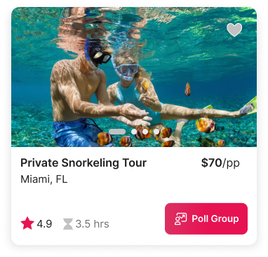
Provide users with a seamless experience by displaying key information within swipe-able activity containers. These containers will offer photos for easy swiping, accompanied by experience names, customer ratings, and prices. Users can delve deeper by clicking the container to access comprehensive details like photos, reviews, location, price, cancellation policy, and availability for booking, ensuring a well-informed decision-making process.
Group Collaboration
Implement a Group Feature allowing users to form groups, invite members, and utilize group chats for streamlined communication. Within these groups, members can propose activity options with selectable dates and times for polling and voting. The combined preferences enable the group to collectively decide on agreeable activities and attendance. Additionally, users can associate booking confirmations with their groups, facilitating the visibility of upcoming plans among members.
INFORMATION ARCHITECTURE
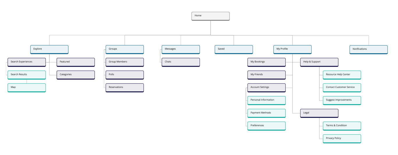
The findings have allowed me to craft an information architecture that is intuitive, efficient, and tailored to the needs of our users. The structure is designed to guide users seamlessly, reducing cognitive load and enhancing engagement.USER STORY (MVP)
In developing my User Story MVP, my research findings directly influenced the inclusion of key features tailored to user preferences.Recognizing the significance of location, I incorporated a map feature to facilitate browsing and visualizing activity locations.
Understanding the importance of customized search results, I integrated filters to cater to users' specific preferences.
Acknowledging the need for organization, the MVP includes a favorites list to streamline the saving and organization of searches.
Given the emphasis on group planning, the MVP encompasses multiple group features, enabling users to create, invite friends to, and make collective decisions within a group.
USER FLOW
I constructed a user flow that caters to every step of the journey. I began by mapping out the essential features and functionalities of the GroupGo app.
LO-FI WIREFRAMES
After meticulously crafting the user flow, the lo-fi wireframes served as a tangible representation of the proposed interface and flow. These wireframes not only captured the overall layout and structure of the interface but also incorporated specific details, such as button placements and content arrangement. Once the sketches were ready, I embarked on guerrilla testing. DESIGN & TESTING
USABILITY TESTING
Armed with my lo-fidelity, I approached potential users to gather quick feedback on the proposed flow. This agile and informal testing approach provided invaluable insights into the usability and viability of my design concepts, enabling me to refine and iterate on my ideas effectively.REGISTRATION SCREEN
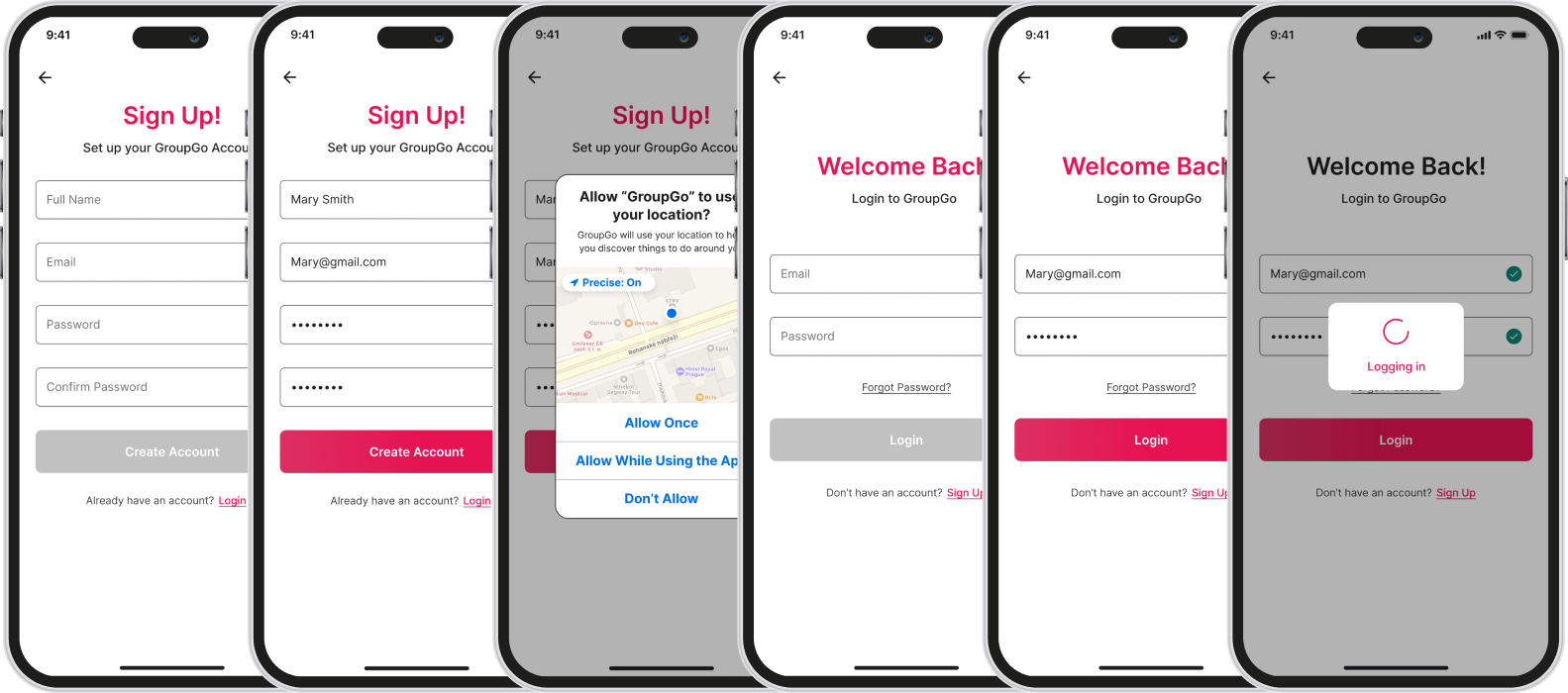
It became evident that initiating with an email entry proved confusing for users, blurring the line between logging in and creating an account.
To rectify this, I introduced two distinct buttons, providing clarity and addressing this user concern.
EXPLORE SCREEN
Users expressed confusion about changing their location on the Explore screen, with some suggesting it should be integrated into the search bar.
To address this, the location feature was incorporated onto the right side of the search bar, demarcated by a light vertical line and enhanced text visibility through darkened font.
GROUP OVERVIEW SCREEN
The "Activities" tab was eliminated from the group screen due to user feedback deeming it unnecessary.
Additionally, the "Bookings" section was relabeled as "Our Plans" to eliminate confusion, as users had initially perceived it as the booking destination.
SEARCH RESULTS SCREEN
Users found the initial search result screen overly cluttered and had difficulty locating the map button.
To address this, the decision was made to streamline the interface by eliminating the map icon and introducing a floating button.
Additionally, users expressed a preference for having only the search bar at the top, leading to the adjustment of the layout.
START A POLL SCREEN
It became evident that users desired the ability to select multiple dates when polling an activity.
In response, I adapted the design to allow users to choose up to three different times, and I incorporated containers to neatly organize each selected time frame.

After conducting guerrilla testing, I found valuable insights to refine my wireframes. The wireframes allowed me to communicate the core functionality and structure of my design, ensuring that I addressed pain points and met user needs. MID-FI WIREFRAMES
BRAND PLATFORM
I established key brand attributes and values that resonate with our users. Next, I focused on defining the visual identity of GroupGo, crafting a unique logo, color palette, typography, imagery, and design component guidelines. I ensured that these elements were not only visually appealing but also aligned with the brand's personality and objectives. Armed with this brand platform and style guide, I was equipped to begin designing the hi-fi screens, ensuring a seamless and visually cohesive user experience for GroupGo's audience.Mission
At GroupGo, we empower individuals to explore their surroundings and create unforgettable memories with their loved ones. We aim to simplify the process of organizing group outings, giving our users more time to enjoy their leisure time together.
Vision
Our vision is to create a world where exploring new places, trying new things, and connecting with friends is effortless and accessible for everyone.
Name Rationale
The word “Group” implies the social interaction portion of the app, and the word “Go” implies it is for people who are on the move and looking for something to do. Together the words suggest looking for something to go and do together as a group. It’s also short and catchy making it easily memorable.
Brand Attributes
Adventurous, Accessible, Social, Memorable, Effortless
Adventurous gives a sense of excitement and adventure. It’s inclusive because it should be easily accessible to everyone regardless of their background or circumstances. Valuing human connection and emphasizing the importance of quality time reflects a sense of social values through interaction and connection. It’s about making the most of every moment and helping people create unforgettable memories creating a sense of sentimentality. Simplifying the process of organizing group outings makes it effortless for users to make the most of their leisure time together.
STYLE GUIDE
Imagery
The images should be genuine and convey adventure, excitement, and fun as if the users were being transported to the experience through the images. There should be photos of people enjoying themselves and of the memories they created.
Colors
I opted for a red-pink hue as the primary color for the Group Go brand. Red serves as a visual representation of the brand's adventurous nature. It symbolizes the determination and courage that Group Go possesses to explore new horizons and venture into uncharted territories. Pink brings a balance of playfulness, compassion, and love. The Group Go brand intends to create a sense of community, fostering connections and relationships among individuals. This color choice communicates the brand's commitment to inclusivity and encourages people to engage with Group Go in a warm and inviting manner.
Typography
Elements

USABILITY TESTING
After conducting the initial round of usability testing, several valuable insights emerged. Notably, users encountered challenges when attempting to add a profile photo. To address this, I replaced the previous button with an empty profile icon and introduced a small camera button on the right side for clarity and ease of use.Another significant observation was users' difficulty in locating certain category filters. Initially, these filters were nested within the activity type filter. However, based on feedback from participants, it became evident that separating the Category filter as an independent entity was essential to enhance user navigation and accessibility.
HI-FI SCREENS
Onboarding Screens
Booking & Checkout Screens
Registration Screens
Activity Search Screens
Group Screens
THE PRODUCT
MOVING FORWARD
GroupGo is committed to a user-driven approach that revolves around continuous improvement. We'll persistently gather user feedback, conduct usability tests, and scrutinize user behavior to pinpoint areas for enhancement. Iterative design remains pivotal, ensuring GroupGo evolves directly in response to user needs. We'll focus on expanding our activity database, providing a wider array of options, while also fine-tuning group booking features for intuitive coordination.


