Cohort Managment Platform
My Role: Team Lead, UX Researcher, UX Designer
Duration: 4 Weeks
The Client
The next-gen talent platform that connects students and companies for real-world projects.Schwap is a community marketplace where handpicked and vetted uni students do mini projects for top-tier founders in exchange for hands-on experience, compensation, mentorship, referrals, and real career capital.My Role
UX Designer & Researcher
Conducted user and competitor researchSynthesized research findingsDeveloped information architectureCreated wireframes & prototypesConducted usability testingImplemented insights into high-fidelity designs for refinement
Team Lead
Led a team of 3 designersManaged all client communicationsHandled team & client schedulingDelivered hand-offsLed client meetings
Duration
4 weeks
Tools
Design Process
The Challenge
Schwap faces operational inefficiencies due to the absence of a centralized platform for managing cohorts, students, projects, and company partnerships. This creates challenges in organization and oversight, particularly in monitoring matches between students and company projects. Therefore, developing a comprehensive internal platform is essential to address these critical challenges and streamline operations at Schwap.
The Objective
Design and implement a comprehensive web platform solution tailored to the specific needs of Schwap.
Cohort Management
Develop a user-friendly interface enabling the creation and management of cohorts and facilitates cohort updates.
Project Organization
Implement a project organization system providing visibility into projects associated with cohorts and handling incoming projects requests from companies.
Matching Oversight
Establish a matching oversight system, enabling Schwap to monitor the status between students and company projects.
The Project Scope & Plan
From a student-facing mobile app to an internal facing web platform.
The project scope, set by the client, changed a few times.
Initial Scope
When we initially received the project scope from Schwap, the goal was to scope, design, and help Schwap’s tech team implement a student-facing mobile app in the form of an AI concierge.
Actual Scope
After speaking with the client, the new goal was to scope, design, and implement an institution-facing (Schwap) web platform for cohort management.
The Kick Off
Communication was challenging due to managing 4 different time zones between Schwap and my team. Our main point of contact, the CPO and Co-founder of Schwap was unable to attend the call, so met with the head of product operations on the student and institution sides.
During the call:
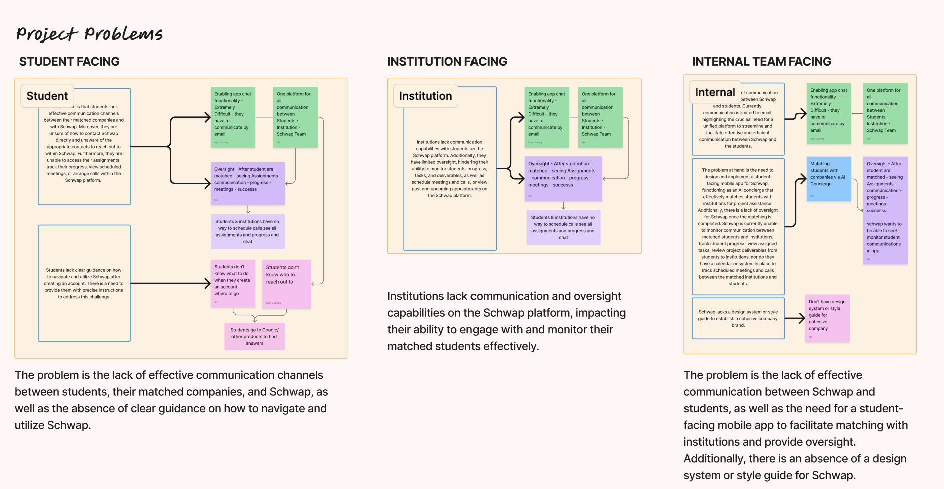
Uncovered many areas where Schwap faced challenges pertaining to the student, company, and institution facing sides
Decided on one communication channel (Discord) in order to make communicating easier and effective
After the call:
Created sticky notes in figjam for the problems & goals gathered from the call & organized them by user
Chose to focus on the student-facing side as in the initial scope and created the project plan accordingly
Given our time-constraints, we decided to focus on one user type in order to do a thorough job
The Pivot
After we devised our project plan, we received an email from the CPO & Co-founder that we should focus on the institution facing side instead.
Pivoted and adjusted our goals and problem statements to reflect the new project scope
Altered our project plan to the new scope and adjusted it to account for the time lost
The Final Plan
Our final end-to-end plan starting from research to hand-off. We created a more detailed plan outlining the tasks and deliverables and grouped them into milestones.
DISCOVERY
After drafting a research plan, our team delved into comprehensive competitor and product research, conducted interviews with the client (the primary user), and audited their existing wireframes.
Initial Interviews
Since the primary users were Schwap employees, we conducted informational interviews with Schwap to understand their perspectives, challenges, and requirements related to operational inefficiencies and internal management needs. We needed to better understand their:
Business & User Goals
Constraints
Current Experience
Business & User Goals
Needs and Wants
Success Metrics
User Types
Current Task Flow
Competitor Analyis
We then explored existing platforms and tools, suggested by our client, that are used in similar contexts to identify best practices and potential features that could improve Schwap's platform.
Design Audit
Reviewed and audited the existing wireframes provided by Schwap to identify gaps, inconsistencies, potential usability issues, main flows, and areas for improvement, ensuring alignment with user needs and workflows.
After auditing each screen, we synthesized all of the information using an affinity diagram, which helped us create our user stories and set the stage for creating our MVP.
User Story Mapping
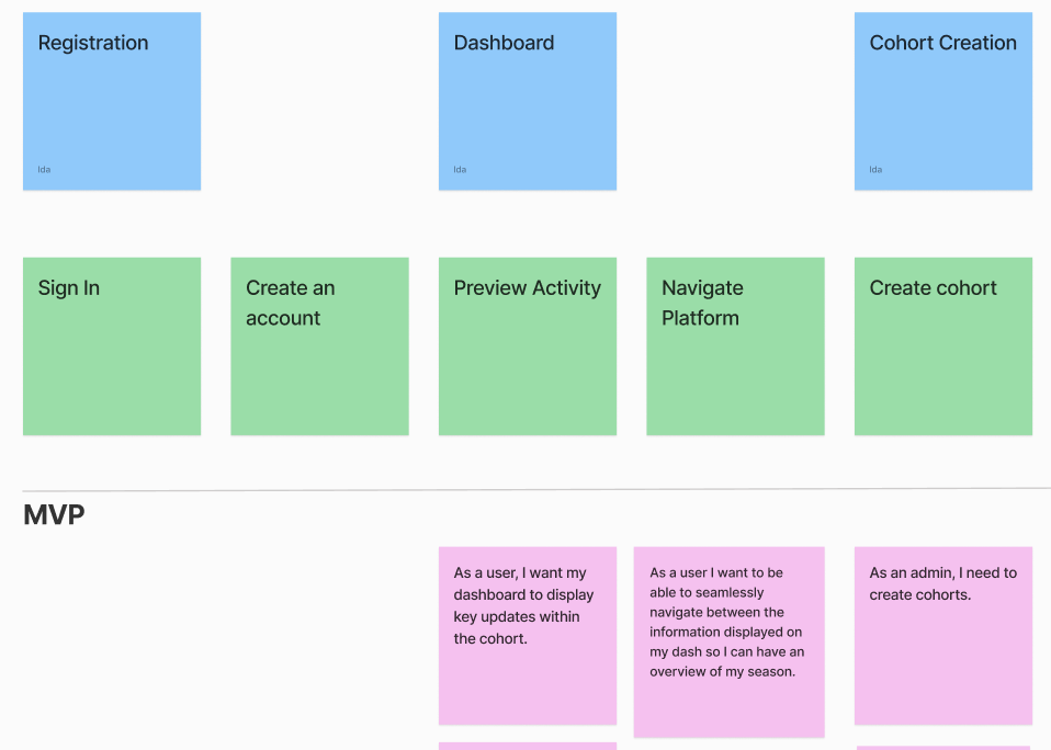
In order to decide our MVP, I recommended creating a sticky for each user story and voting on them individually. Using Figjam stickers we each voted on whether it should go into the MVP or Backlog. By creating our User Story MVP, we were able to prioritize the key features.
IDEATION
Site Mapping
Following the discovery phase, each team member developed an individual site map. We then collectively reviewed and consolidated our individual site maps to create the final version, which formed the basis for our designs and deliverable to the client. Ultimately, my site map was chosen as the foundation, and the team collaborated to make refinements for its final iteration.
User Flows
Following the finalization of the site map, each team member embarked on developing a user flow. Despite distinct individual approaches, there were some commonalities in our perspectives and ideas. To consolidate these diverse perspectives, I proposed focusing on the primary user tasks. This led to the decision of using the fundamental structure of my user flow as a foundation, which we then deconstructed into distinct flows for each task.
Mid-Fidelity Wireframes
Once our sitemap and user-flows were established, we proceeded with the creation of wireframes to facilitate testing of the prototype. Taking the lead in generating the wireframes, I ensured their completion before delegating the task of making them interactive for the prototype to a team member. I then wrote out the test plan, while another teammate developed the testing script, effectively coordinating the preparation for prototype evaluation.
USABILITY TESTING
Round 1
Schwap facilitated the scheduling of testing sessions with their employees for our team. The testing was conducted through Google Meet, allowing participants to share their screens as they completed tasks, while one team member facilitated the sessions and others observed and took detailed notes. Following the testing sessions, all team members had the opportunity to engage with participants, posing additional questions to further enrich our understanding.
Critical Insights
After concluding the testing sessions, we documented insights on sticky notes. Using these insights, we created an affinity map to effectively group and categorize the findings. We then summarized the insights within each category, and classified them as crucial, major, or minor based on the frequency of occurrence and the quantity of sticky notes within each category.
STYLE GUIDE
Prior to delving into high-fidelity designs, our team initiated the creation of a style guide. Following prior discussions, we made the decision to utilize the Inter font. I took the lead in establishing the typography and saved the styles directly in Figma. Drawing inspiration from the provided files and aligning with the client’s preferences and Schwap’s existing branding, we formulated a color scheme. Additionally, I curated the spacing, selected the icons to be used in our designs, and undertook the creation of components to ensure design consistency across the separate pages, considering that each team member would be working on distinct sections.
Font
Colors
Icons
Buttons
Status
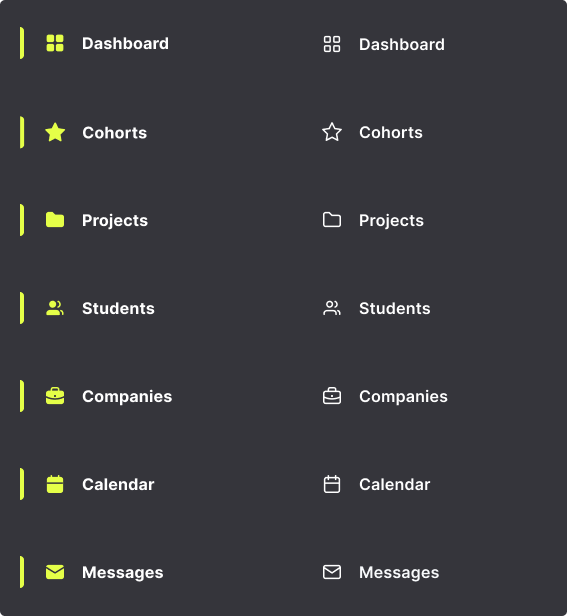
Navigation

HI-FIDELITY
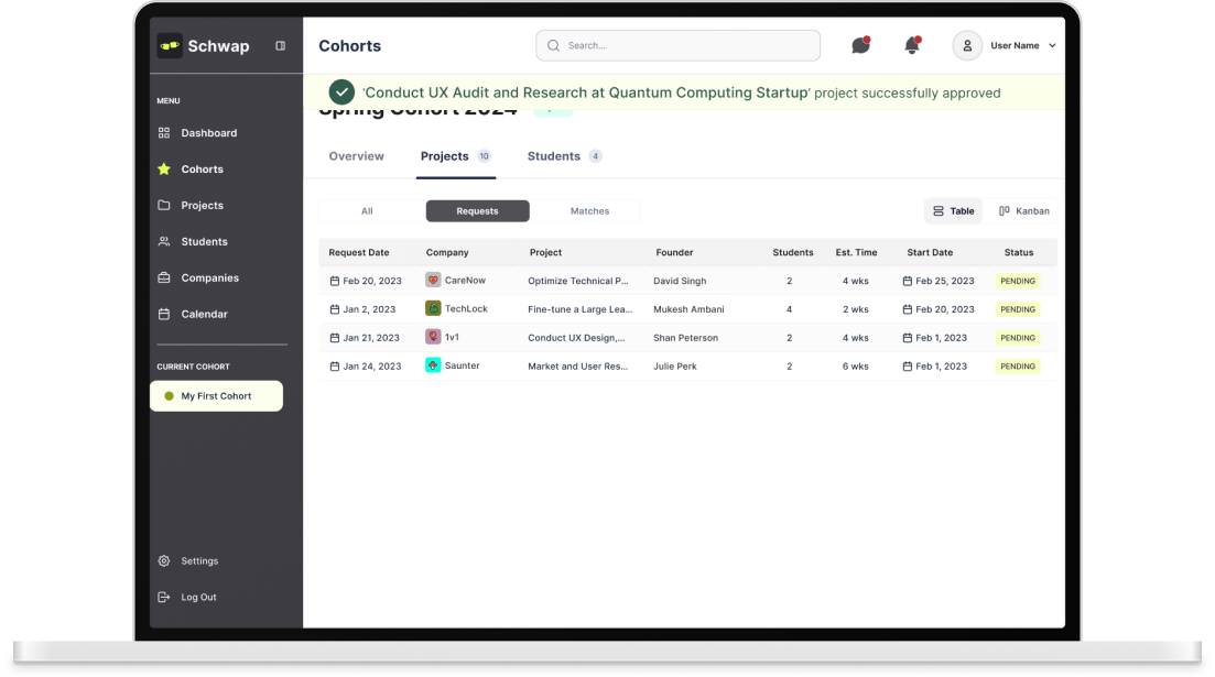
Utilizing our established style guide as a foundational resource, we crafted high-fidelity designs that were informed by the invaluable feedback garnered from the initial mid-fi prototype. This iterative process not only allowed us to apply consistent visual and interactive elements in line with our brand's principles but also facilitated the integration of user insights and preferences into the final design iteration.
USABITLITY TESTING
Round 2
After prototyping our hi-fi designs, we initiated the second round of testing. While Schwap employees currently serve as the primary users, Schwap intends to expand its user base in the future. To mitigate bias, we conducted testing with 6 participants, comprising of both Schwap employees and non-Schwap employees. We then synthesized our findings in a manner consistent with the approach used in the first round of testing.
Testing Insights
Final Steps
I provided Schwap with a shared Google Drive folder containing all our documentation and Figma design files. This encompassed our Figjam collaboration files, including competitor and product research, design audit, user flows, as well as ideation, comments, designs, and usability test reports highlighting key findings and insights. The documentation encapsulated our design process and rationales, serving as a reference for future iterations
Key Takeaways
The transition from coursework to working with a real client and a team has taught me that in practical scenarios, it's not always feasible to follow each step meticulously. I've gained insight into the crucial need to adapt and pivot according to the client's requirements, navigating through the additional complexities of differing time zones. Working within a team presented its own set of challenges, particularly in terms of task allocation and determining the most effective approaches. However, through perseverance and a process of trial and error, we successfully overcame these obstacles and developed effective strategies for managing our workload.


