Modified GV Design Sprint
Product Selection to Checkout
My Role: UX Researcher, Designer
Amidst a rapidly expanding digital library, the challenging task of sifting through numerous options to find the perfect story requires a solution. Enter TinyTales, dedicated to simplifying story sharing and discovery for parents to enhance shared reading experiences. As the sole designer, I embarked on a five-day sprint, embracing the challenge and envisioning a user-centered approach to deliver a solution. This is the story of how TinyTales came to life, merging innovation and user-centricity within the accelerated timeline of a design sprint.The Product
TinyTales is a new startup where authors and illustrators can publish children's stories for parents to read to their children via their tablet app.
The Challenge
The challenge is to address parents' frustration with the time-consuming process of finding stories for their children, which impedes the valuable reading time they could spend together. There is a need for a streamlined solution to facilitate the efficient selection of stories, ultimately aiming to create more opportunities for quality reading time between parents and their children.
The Solution
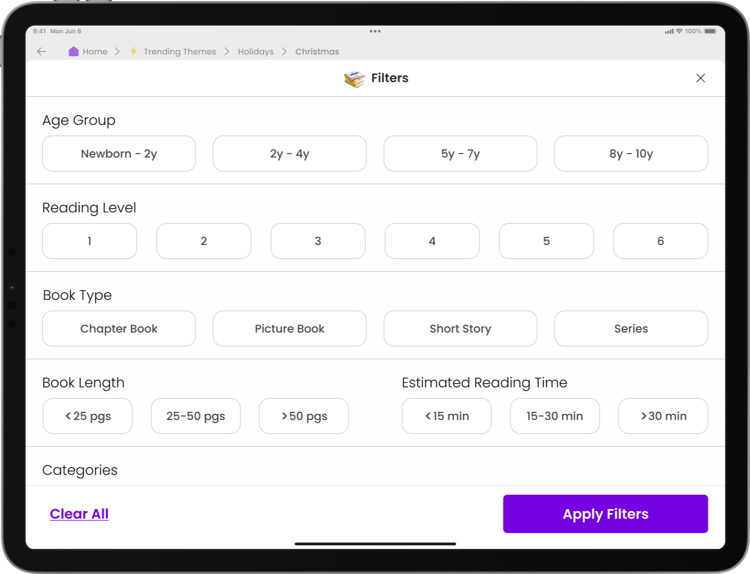
The solution entailed the design of a user-friendly iPad application featuring organized stories and advanced filtering capabilities, allowing parents to effortlessly navigate, explore, and select a suitable story option. This platform empowers parents to swiftly discover stories based on various factors such as age-appropriateness, reading levels, categories, themes, and reading durations. Additionally, it incorporates a feedback system to tailor personalized recommendations and aid fellow parents in discovering stories effectively.

My Role
As the project's sole UX Designer, my responsibilities encompassed analyzing research to extract valuable insights, sketching solutions, prototyping, and validating design solutions through usability tests. My central focus was on crafting a holistic solution that addressed the specific pain points faced by parents in finding stories for their children. I navigated the project from concept to execution, ensuring a user-centered and impactful solution.
The Process
The project journey embraced the Google Ventures Design Sprint method, modified for single-person execution. Each day was dedicated to a key task within the design sprint framework, with the objective to build and test a prototype within a compressed five-day timeline. The process encapsulated the essence of Design Thinking and rapid problem-solving through prototyping, testing, and user-centric design.Day 1
Discovering the Problem & Mapping
On the first day of the sprint, my focus was on synthesizing the research given to me, which included provided quotes, a detailed persona profile, and a user interview recording. To begin understanding this problem, I went through the interview recordings and quotes provided by Bitesize UX to understand the process parents go through in selecting books to read. By analyzing the research, I sought to unveil common behaviors and recurring challenges amongst users to inform the problem-solving process. 
PERSONA
Claire Bishop, 34yr
Children: 2 (6yr & 4yr)
Behavior
Reads to her children at least 3 times a week - usually before bed
Values this time - reading to her children is an important part of "family time"
Reading to her kids is a good way for them to learn & ask about their interests
Finds stories that her children will love - so they will appreciate reading from an early age
Frustrations
Spending more time looking for a story than reading it
Spending time flipping through to see story length, age appropriateness, and learning points to benefit her kids
Not easy to find a story about a new topic or experience that interests her kids
Goals
Spend less time finding a great story to read to her children.
Find stories that both of her children will understand and enjoy.
Find stories about certain topics that her children are interested in, or learned about in school.
Find stories that her children will find entertaining, but that also contain some learning lessons or educational value.
INTERVIEWS
I careful listened and took detailed notes of the pre-recorded interviews I was given. By analyzing these interviews I was able to uncover crucial user needs and preferences and identify common themes, which in turn informed the design and development of the solutions.

INSIGHTS
The information gathered from the user interviews and the established persona allowed me to identify key insights. These insights will serve as a valuable foundation for creating a user-centered design that successfully addresses users' needs and expectations.It’s difficult and time-consuming to find age-appropriate and suitable length stories to read to their children.
This includes: Topics/interests, story length, amount of time to read, reading level, and age group
Parents like recommendations and read reviews and ratings of stories from other parents.
This includes: the children’s ages of the parent who reviewed the story
HOW MIGHT WE…?
The analysis of the research unveiled common behaviors and recurring challenges amongst users, providing the foundation for crafting "How Might We" questions and laying the groundwork for the problem-solving process. The "How Might We" questions aimed to address these challenges and ideate potential features for the solution-
”Sometimes I like to find a story that is relevant to new experiences in my sons’ life. For example - he's going to a new school, and I wanted to find some stories that could help him handle change, and feel comfortable meeting new people.”
- Lauren, Children: Luke (5 years old) -
“I buy lots of books to read to my kids - I'm always scanning online reviews to see what other parents have to say. I read most of the reviews to see if their children are the same age as mine, and if they enjoyed the topic.”
- Silvia, Children: Andrea (6 years old)
-
“My kids are only a few years apart, but it makes a big difference when finding something they'll both like. It takes a long time to find a book they agree on, let alone one that is a happy medium for them in terms of comprehension level.”
- Margaret, Children: Mason (7 years old) and Alex (4 years old) -
“I usually let my kids pick a topic that they like (dinosaurs are big right now). Then I try to scan through the book to see how long it is. Sometimes we just want a quick book before bed...if it's long, I usually have to stop reading before it's over.”
- Dan, Children: Dylan (6 years old) and Nina (4 years old)
“My son literally judges a book by it's cover - once he find a character or something that piques his interest, I flip through it quickly to see if I think it's the right age level for him, and how long it is.”
- Sara, Children: William (4 years old)

END-TO-END EXPERIENCE MAP
With the insights and persona in place, the end-to-end journey of a user using Tiny Tales to read a book to their kids was mapped. Each step was analyzed to simplify and improve the user journey, aligning with their most important goal of finding a book to read quickly. This comprehensive understanding of the user journey formed the basis for developing a user-centric solution. This pivotal first step set the tone for the days to come, guiding towards a transformative solution for the Tiny Tales app.Day 2
Sketching Solutions
On the second day of the sprint, I harnessed the insights gained from the "How Might We" questions and the user map to kickstart the sketching phase. In addition, I researched solutions offered by competitors who have tackled similar challenges. With an understanding of the challenges and opportunities, I began translating these ideas into visual representations.
COMPETITOR ANALYIS
I researched competitors’ apps to see how they helped users find stories that matched their preferences. I used the findings as visual reference for organizing stories in a way that’s helpful to parents, as well as the functionality for searching and filtering stories to fit their childrens needs.Pros
Containers with relevant information
Preview of story
Showed rating
Cons
Not very kid-friendly
Reviews lack children’s ages
Difficult to read - important tags don’t stand out
Pros
Showcased a diverse arrangement of stories and books, categorized by various themes and genres.
Showed trending and most popular first
Cons
Overwhelmed by the amount of information and categories
Lacked some information that’s preferred by parents
Not very kid-friendly
Some were difficult to navigate
Pros
The imagery, colors, and kid-friendly filters
Cons
Some filters were confusing
Lacked important filter options
Multiple steps to find story

SKETCHES
3 PANEL BOARD
I delved into the visual and interactive aspects of the Tiny Tales app. Building on the end-to-end experience map created on the second day, I began by sketching screens and visualizing potential solutions for the app. This stage allowed me to translate the identified user pain points and goals into tangible design elements and user interactions. Following the initial screen sketches, I concentrated on designing a 3-panel board focusing on the story results screen. By focusing on the story results screen, I aimed to provide a seamless and tailored experience for parents seeking age-appropriate, thematically relevant, and suitable-length stories for their children. With the critical screen set in place, I then proceeded to sketch the screens that I felt should precede and follow the story results screen. 
Day 3
Storyboard of the primary user flow
On the 3rd day, I continued the momentum from the previous day by finalizing the sketches to create a cohesive storyboard of the primary user flow for the Tiny Tales app. This stage allowed me to visually depict the end-to-end user experience. By structuring the storyboard to reflect the user's interactions and decision points, I was able to weave together the visual and interactive aspects of the Tiny Tales app, ensuring that every screen and feature aligned with the user's goals and pain points identified earlier in the sprint. By completing the sketches and creating a storyboard of the primary user flow, I set the stage for the prototyping phase to bring the envisioned user experience to life.
STORYBOARD
1.Home Screen
Search for a story by keyword or category
4.Filtered Results Screen
Display updated results based on selected filters
7.Finish Story Screen
Read the chosen story to your child
The home screen is where the user embarks on their journey to find the perfect story. From there, the user progresses through the app's interface, utilizing intuitive search and filtering options to pinpoint the ideal story for their child. Once they have read the story to their child, the user provides valuable feedback on their child's enjoyment of the story. This feedback loop plays a vital role in enhancing recommendations, especially for parents with multiple children, effectively addressing one of the core challenges we aim to solve. By concluding with this feedback process, the storyboard encapsulates the user's comprehensive experience, highlighting the user-centric approach at the heart of the Tiny Tales app.2.Results Screen
Display results based on search
5.Filtered Results Screen
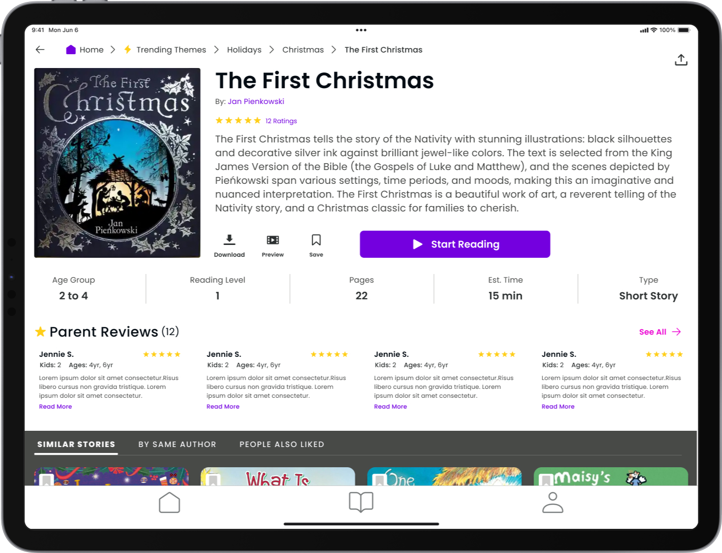
Review more story details and start reading
8. Children Feedback
Give feedback and receive recommendations
3.Filter Screen
Filter results based on specific preferences
6.Start Story Screen
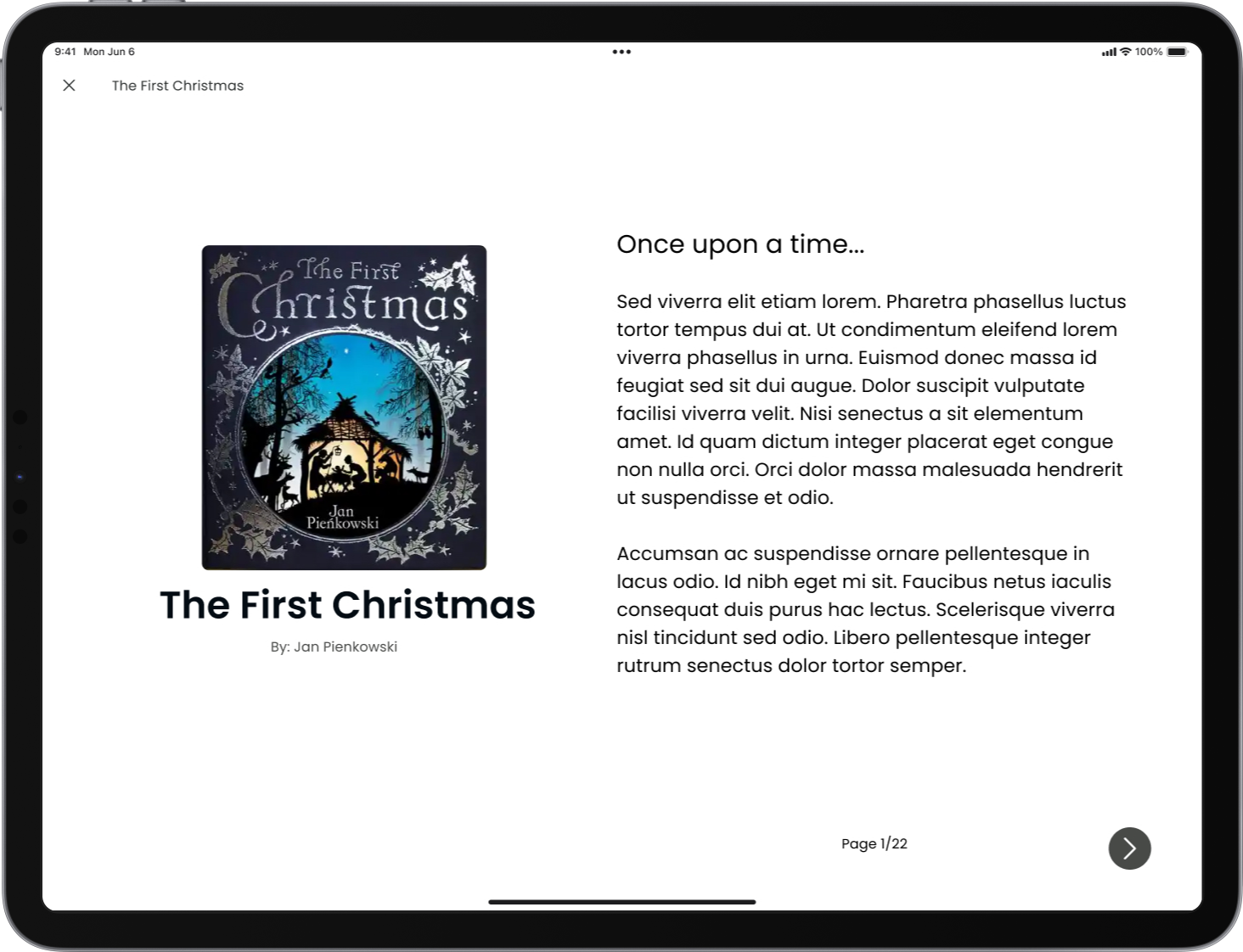
Read the chosen story
9. Parent Feedback
Give feedback to help other parents
Day 4
Creating the Prototype
On the fourth day, I focused on creating a functional prototype, building upon the storyboards and sketches from the previous day. This allowed for a tangible understanding of the solution's functionality and user experience, enabling potential users to interact with the prototype and provide valuable feedback for further refinement. This step marked a significant milestone, bringing the conceptualized solution closer to a tangible reality.
DESIGN & PROTOTYPE
The prototype aimed to provide a hands-on understanding of the solution's functionality, enabling potential users to interact with the prototype directly. The prototype not only demonstrated the progress made in the sprint but also served as an instrumental tool for soliciting user input and guiding further iterations and refinements.

Day 5
Usability Testing
On the last day, I conducted usability testing for the Tiny Tales app with five participants, comprising parents and grandparents aged between 30 and 60. Three participants were tested in person using my iPad, while the other two engaged with the prototype on Figma and shared their screens.
Finding a Story
All participants successfully completed the task of finding a Christmas story suitable for children aged 2-4, featuring a reading level of 1 and having fewer than 25 pages.
Serves as a strong indicator that the process of locating a story aligned with the users' preferences to read to their children and grandchildren was intuitive and effective within the current app design.
Demonstrates the app's capability to effectively filter and present relevant content according to the specified criteria, thereby enhancing the overall user experience.
Highlights the app's intuitive design in enabling users to effortlessly navigate and find the most suitable content for their intended audience.
Rate Stories for Children
The introduction of the feature allowing users to rate stories for individual children is well-received and considered valuable by users.
Tailoring the content to individual users, in this case, their children, is a feature that resonates with parents and positively impacts their interaction with the app.
Emphasizes the importance of personalization in the app's user experience and suggests potential for further personalization.
Provides a means for users to curate content suitable for their children's interests and preferences and signifies a potential for increased user engagement.
TESTING INSIGHTS
Insights from the usability testing have revealed several significant findings.
Content Organization
4/5 participants suggested that holidays and Christmas should be categorized under 'Categories' rather than 'Trending Themes.
Disconnect between the current organization of content and the expectations/preferences of the user base.
Signifying the need for re-evaluation and refinement.

Next Steps
Addressing this feedback and undertaking further steps to refine the organization of story genres will be critical for enhancing the overall user experience of the app. To achieve this, the implementation of card sorting exercises to reassess the categorization of themes and genres will be essential. This approach will enable the app to better reflect user preferences and create a more intuitive and user-friendly platform for accessing and enjoying content.

This insight serves as a pivotal point for future improvements, aligning the app more closely with the needs and expectations of its user base. It also emphasizes the proactive approach of the development team in responding to user feedback to deliver an app that provides a seamless and enjoyable experience for its users.


