E-Commerce Case Study
Product Selection to Checkout
My Role: UX Researcher, Designer
PROJECT OVERVIEW
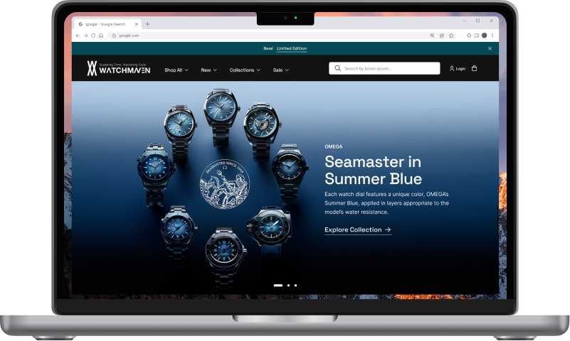
In this case study, I will address the user experience challenges faced by WatchMaven, an online watch retailer. WatchMaven aims to significantly enhance the usability of their website, particularly in the areas of browsing and checkout. The overarching goal is to boost revenue by improving the conversion rate from product browsing to completing the checkout process.
PROBLEM STATEMENT
WatchMaven aims to address two key issues.
1. A significant portion of users (50%) browse multiple product pages but abandon the site before adding items to their cart. This behavior suggests that users struggle to discern the best watch choice based on features.
2. A substantial 70% of users who place an item in their cart do not complete the purchase. Data reveals that cart abandonment primarily occurs at the registration page, where users are required to create an account.
OBJECTIVES
1. Increase Conversion Rates
Enhance the conversion rate from browsing to completing the checkout process, ultimately driving higher revenue for WatchMaven.
2. Reduce Cart Abandonment
Mitigate cart abandonment at the registration page by implementing a guest checkout option while capturing user emails.

SOLUTIONS
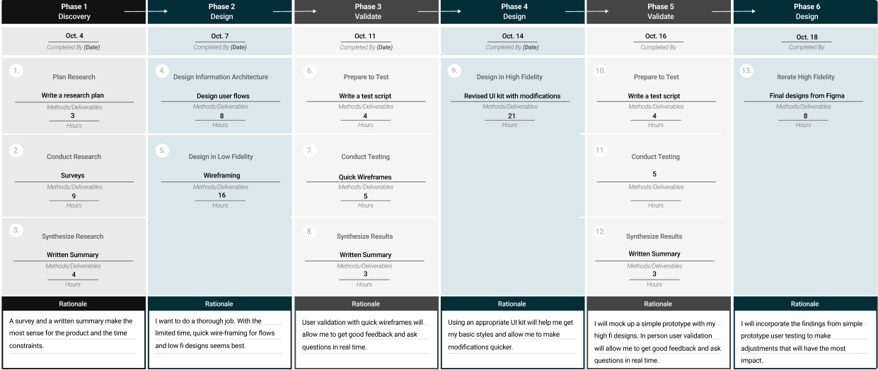
PROJECT PLAN
RESEARCH
DISCOVERY
Questionnaire/Survey
I used a survey for my primary research due to its effectiveness in swiftly gathering direct feedback and valuable insights. This method allowed me to quickly and efficiently gather insights pertaining to user preferences, expectations, and pain points, which was crucial given the time constraints. By distributing the survey to a large number of participants within a short timeframe, I was able to obtain a diverse and representative sample of user feedback, providing a comprehensive understanding of their needs and pain points. This method not only facilitated rapid data collection but also enabled me to make informed design decisions that are firmly rooted in user insights, enhancing the overall effectiveness of the improvements made to WatchMaven's website.
Users typically rely on search filters and categories to narrow down their options.
The likelihood of users using guest checkout.
How users feel about registration requirements to complete a purchase.
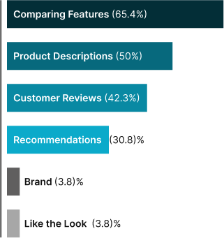
How users typically determine the best watch for their needs.
INSIGHTS
Browsing
The majority prefer to browse by searching for specific watches and scrolling through product listings.
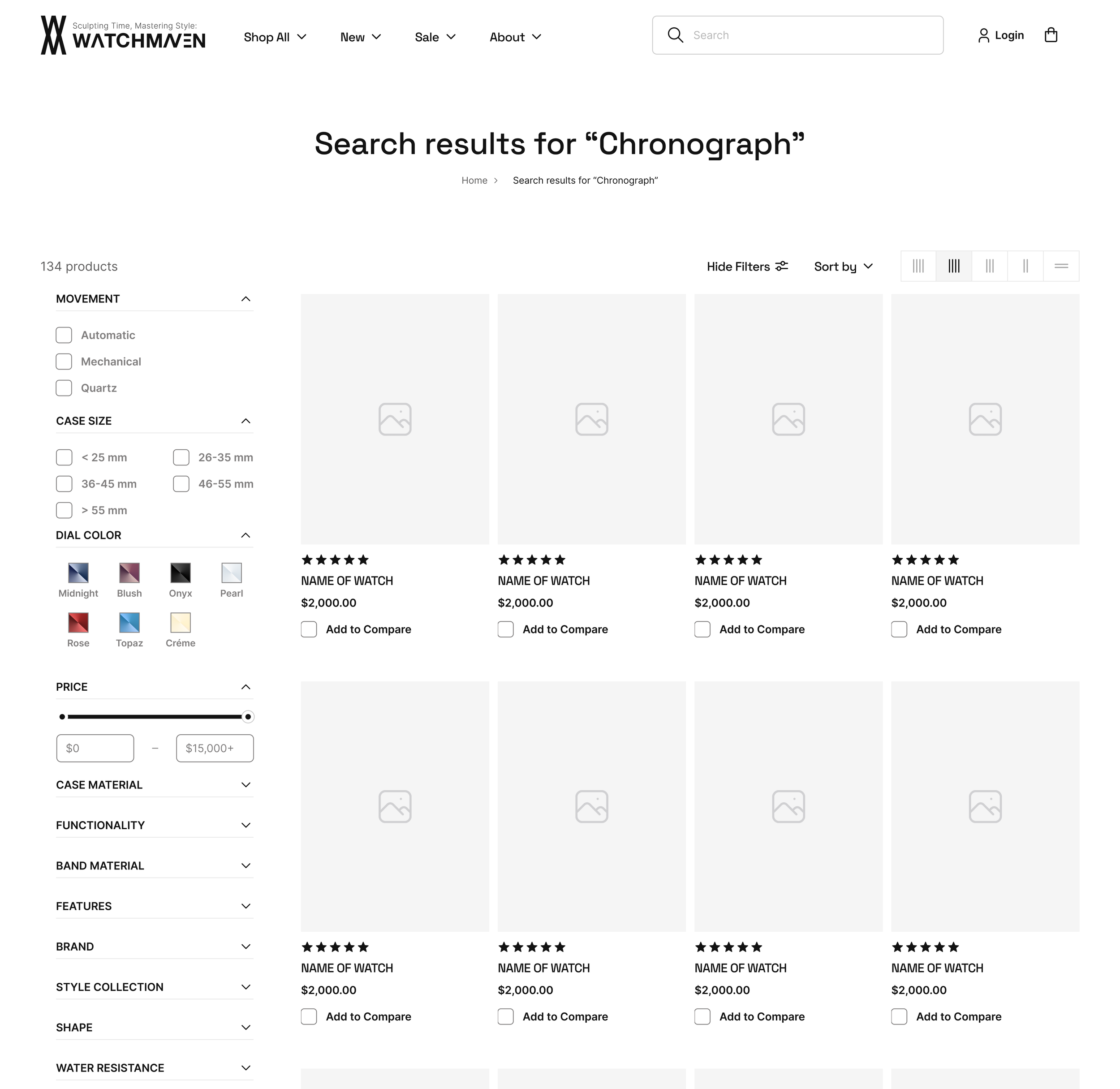
Users often rely on search filters, categories, and sorting options to navigate and narrow down their watch options. This indicates the importance of implementing intuitive and effective filtering and sorting mechanisms to streamline the browsing experience.
Decision-Making
Users exhibit a research-driven approach when shopping for watches online, emphasizing the importance of providing comprehensive product details.
A considerable number of users engage in comparing watch features and specifications to determine the most suitable option. Providing easily accessible comparison tools can facilitate the decision-making process.
Checkout
A significant portion of users expressed a preference for a guest checkout option. Most users identified the availability of a guest checkout option as a key factor that would encourage them to complete their purchase.
These insights support the decision to implement a guest checkout option, streamlining the path to purchase.

USER FLOW
DESIGN
In developing the User Flow for WatchMaven, I translated key insights gathered from user research into a structured and intuitive path for users. The User Flow is the backbone of the WatchMaven design, shaping the platform's structure and functionality, and serves as a roadmap for navigating the platform, outlining the optimal journey users should follow to achieve their goals.

WIREFRAMES
DESIGN
These wireframes represent the foundational blueprint of WatchMaven, offering a visual representation of the user-centric design. They served as the basis for the first round of user testing, providing a tangible medium through which users can interact with and evaluate the platform's structure and functionality.
TESTING 1
VALIDATE
Clean and Simple Design
Users appreciated the clean and simple layout of the prototype. They found the user experience to be easy and intuitive.
One user's comment, "As long as I can find what I want, clean and simple is good," underscores the importance of a straightforward design.
Filtering
Users highly valued the ability to filter and sort products. They found this feature essential, as not all websites offer it, and it saves time and effort in finding the desired items.
Product Comparisons
Users appreciated the product comparison functionality. It allowed them to quickly assess and contrast features, ultimately saving time compared to individually examining each item. This feedback highlights the importance of this feature.
IMPROVEMENTS
Payment:
Users found the placement of PayPal buttons somewhat confusing. While they appreciated the option for express checkout and the visibility of the PayPal logo, they had trouble locating where to enter credit card information. To address this issue, I redesigned the payment layout for clarity.
Confirmation:
Users indicated a preference for having the total cost displayed on the confirmation page. So I added it to the confirmation page to provide them with a clear overview of their purchase. Users also expressed a desire for updates on the status of their orders, including information on when items are shipped and tracking details. They also wanted to receive a receipt for their purchase. As a response, I incorporate text indicating that the receipt is sent to their email and they will receive a notification once their item ships. Eventually we should incorporate order tracking on the site.
STYLE GUIDE
DESIGN
This style guide serves as the visual foundation of WatchMaven, providing a consistent and appealing user experience throughout the platform.
Black represents WatchMaven's seriousness, focus, and dependability, evoking a sense of expertise and authority in the field of watches. Cyan enhances the brand's savvy and modern image, reflecting its knowledge of the latest industry trends and reinforcing trustworthiness for customers. This color palette blends sophistication and elegance, mirroring the luxury and precision synonymous with high-end watches.
These visual elements create a clean and user-focused design, delivering a visually appealing and intuitive experience. By adhering to these design choices, WatchMaven ensures a cohesive and on-brand user interface that enhances the overall user experience and seamlessly aligns with the platform's core identity.
TYPOGRAPHY
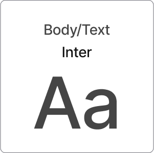
The typefaces strike a balance between readability and a sleek aesthetic, enhancing the user experience and brand identity across the WatchMaven platform.COLORS
The black and cyan color palette conveys sophistication, modernity, luxury, and trustworthiness, aligning with the brand's personality and attributes.BUTTONS
NAVIGATION
The design of the search bar in the website header is based on insight drawn from user research that revealed that more than 50% of users discover and navigate watches on the site through search functionality. By prominently displaying the search bar, users can easily find and explore specific watches, thereby improving navigation and enhancing the overall user experience.
VALIDATE
TESTING 2
Guest Checkout Option
Users expressed a strong preference for the guest checkout option, aligning with the project's goal of introducing this feature as a solution to reduce cart abandonment.Users appreciated the convenience of this feature, as it spared them from mandatory account registration, contributing to a hassle-free purchase process.Users found the checkout process to be straightforward, emphasizing the easy, clear, and manageable steps.
Comprehensive Product Information
The product description pages received favorable feedback, with users finding all the information they needed.The inclusion of multiple photos, reviews, and clear details contributed to their satisfaction.
Sleek Layout
They thought the site was streamlined and sleek, with high-contrast black and blue color schemes.The color choices resonated well with the theme of watches, contributing to an aesthetically pleasing experience
Intuitive Flow & Navigation
Users found the overall flow of the prototype to be efficient and straightforward.Navigating through the site was deemed easy, and users were appreciative of its intuitive nature.
Efficient Selection & Comparison
Users had a positive experience finding and comparing watches.
They liked that this process was quick and straightforward, with filters conveniently placed at the top of the page.
IMPROVEMENTS
Comparison Page:
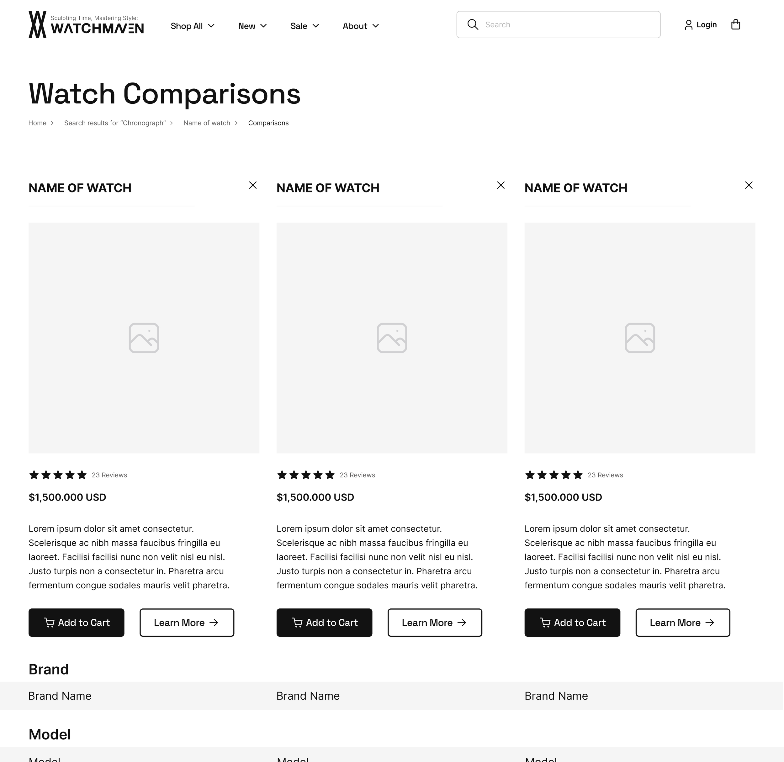
Users encountered challenges on the comparison page, particularly in identifying which watch corresponded with specific features, due to the placement of watch names and photos at the top of the page.To address this, I redesigned the layout to keep watch names and images fixed, ensuring visibility as users scroll through side-by-side watch comparisons.
Additionally, I optimized text size and spacing to create a more visually appealing and user-friendly interface that enhances the page's overall usability.These changes will enable users to easily associate watch attributes during the comparison process, resulting in a more intuitive and engaging experience.
Scroll Bar:
Users expressed a clear need for a scroll bar, suggesting that it would enhance their ability to navigate the site. This feature will improve the overall user experience by making it more intuitive and user-friendly.I incorporated a scroll bar to facilitate smoother navigation, and ensure that users can easily access and explore all content while maintaining a structured and organized interface.

HI-FIDELITY
Design
FINAL TAKE
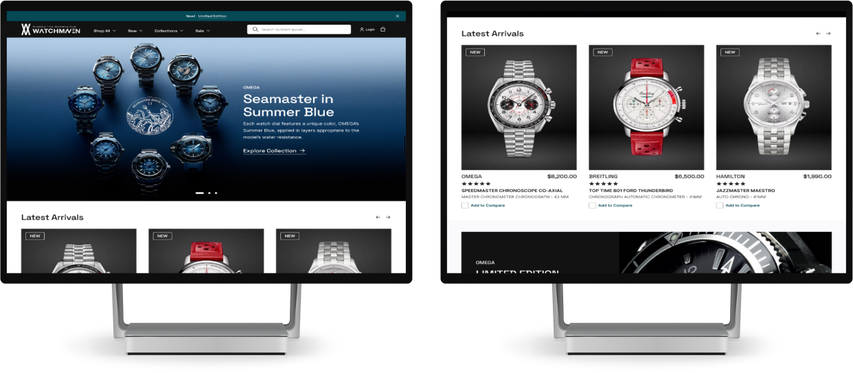
In conclusion, as the UX designer for WatchMaven, I established the project plan and timeline, ensuring that the chosen methods and deliverables aligned with the goals and constraints. The Hi-Fi designs represent a significant milestone in the development of WatchMaven's user experience, and this case study has demonstrated the importance of an iterative design process and the need for ongoing testing to improve the user experience. In order to guide future improvements for WatchMaven, It’s essential to consider the following feedback and insights obtained from users.
It is evident that users highly value updates on shipping and the ability to track the status of their orders. To enhance customer satisfaction, I recommend incorporating an order tracking feature on the website. This feature will provide users with real-time updates and peace of mind knowing the whereabouts of their purchases, ensuring transparency and enhancing the overall customer experience.
Additionally, users expressed an interest in purchasing used high-end watches, which presents an opportunity for WatchMaven to expand its offerings. This expansion would cater to user preferences and provide them with a more comprehensive shopping experience, and attract a wider customer base.
To further enhance navigation and ensure seamless usability, we need to focus on testing the navigation menu and category options to ensure they are intuitive. Card sorting will help us refine the site’s organization and ensure users can easily find the watches they are interested in, resulting in smoother navigation and increased engagement. Regular testing of these features will uncover any potential pain points and allow for continuous refinement.
While WatchMaven has made significant strides, it is important to continue to gather user feedback, test, and iterate as we refine and enhance the platform. By continuously refining the website, WatchMaven can maintain a competitive edge and ensure that it continues to meet and exceed the evolving needs and expectations of its users.


